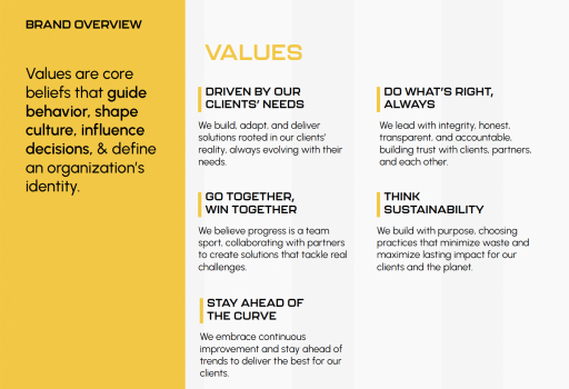
Nektar Inc is a leading Alberta-based data solutions company serving industries across sectors. The brand refresh aimed to modernize Nektar’s visual identity while reflecting its core values of intelligence, connectivity, and sustainable growth.
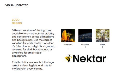
Logo Design
The logo design draws inspiration from honeycomb structures, symbolizing efficiency, connection, and scalable systems. This geometry was combined with concepts of information flow and nature, reflecting how Nektar transforms complex data into structured, meaningful solutions that support long-term growth.
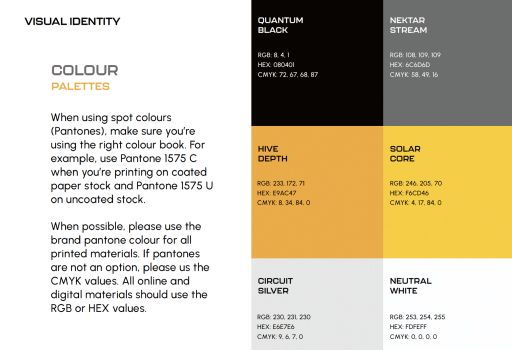
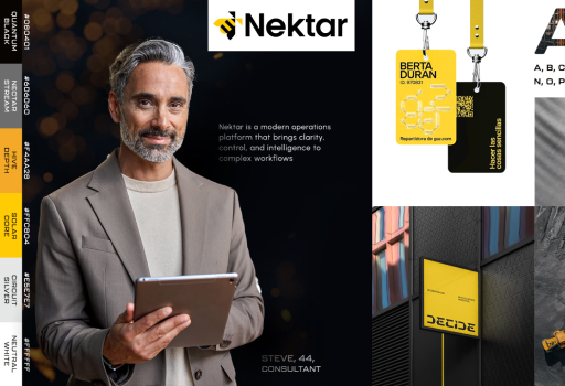
Colour Palette
The colour palette was developed to balance technology and nature, combining grounded, natural tones with modern, digital accents. This approach reinforces Nektar’s positioning as a data-driven company that values stability, clarity, and sustainable progress.
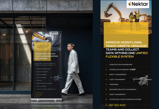
Pop Up Banner
The pop-up banner design translates the refreshed identity into a bold, high-impact physical format. It was designed to clearly communicate Nektar’s expertise at a glance while maintaining strong visual hierarchy, brand consistency, and approachability in event and exhibition spaces.
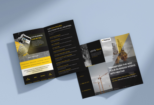
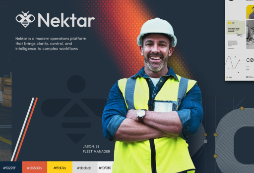
Brochure
The brochure design focuses on clarity and storytelling, breaking down complex data solutions into easily digestible information. Clean layouts, structured sections, and strong visual cues were used to guide readers through Nektar’s offerings while reinforcing credibility and trust.

A creative partner helping you launch, evolve, and own your digital identity, with clarity and purpose.