Oje is an independent menswear brand built around the idea of individuality and timeless style. Rooted in indie subculture aesthetics, the brand embraces authenticity, creativity, and confidence in everyday wear. The challenge was to create a visual identity and digital presence that would not only reflect Oje’s values but also distinguish it in the competitive menswear market. The goal was to design a brand that felt modern yet raw, minimal yet expressive, something that would resonate deeply with its audience.
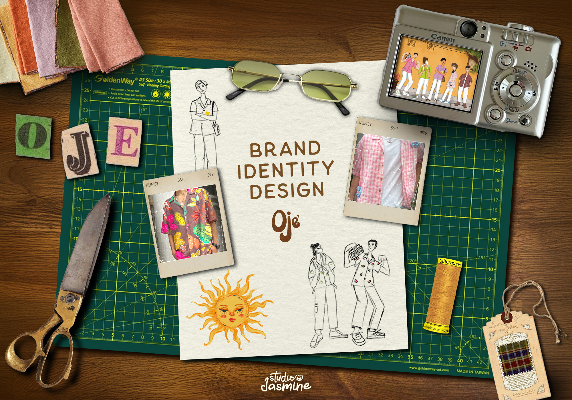
To understand Oje’s positioning, I began with market and cultural research. I looked closely at indie fashion movements, slow fashion trends, and how younger consumers interact with clothing brands. The target audience emerged as urban men aged 20–35, who gravitate toward music, art, and alternative subcultures while valuing quality and authenticity over fast fashion. A key insight was that consumers weren’t just looking for clothing, they were looking for a brand that could become an extension of their personality.
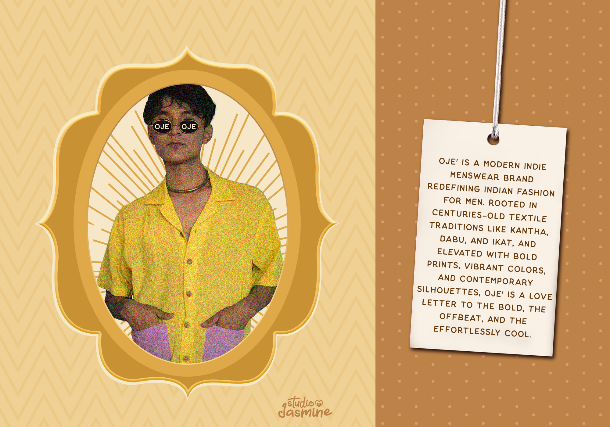
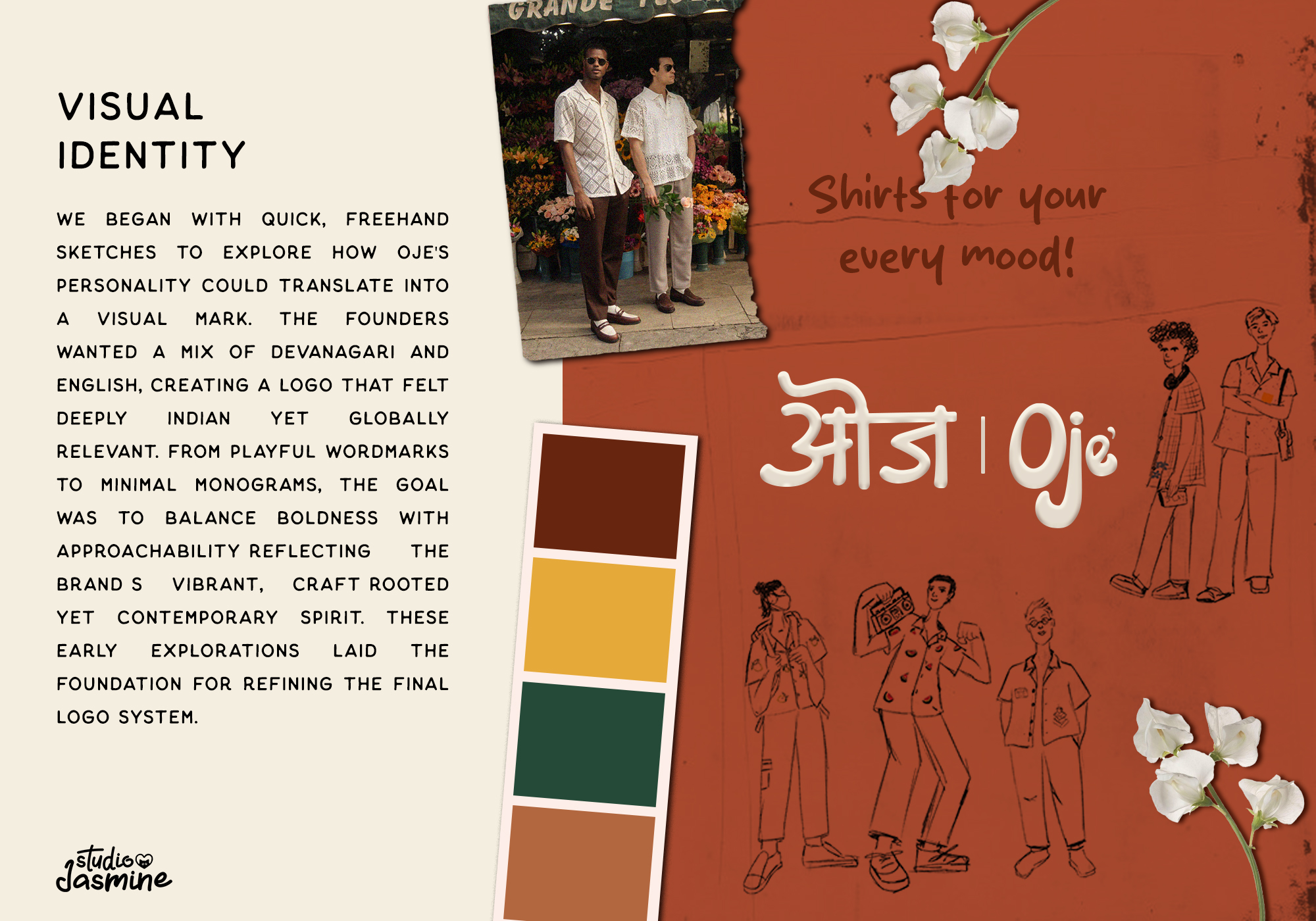
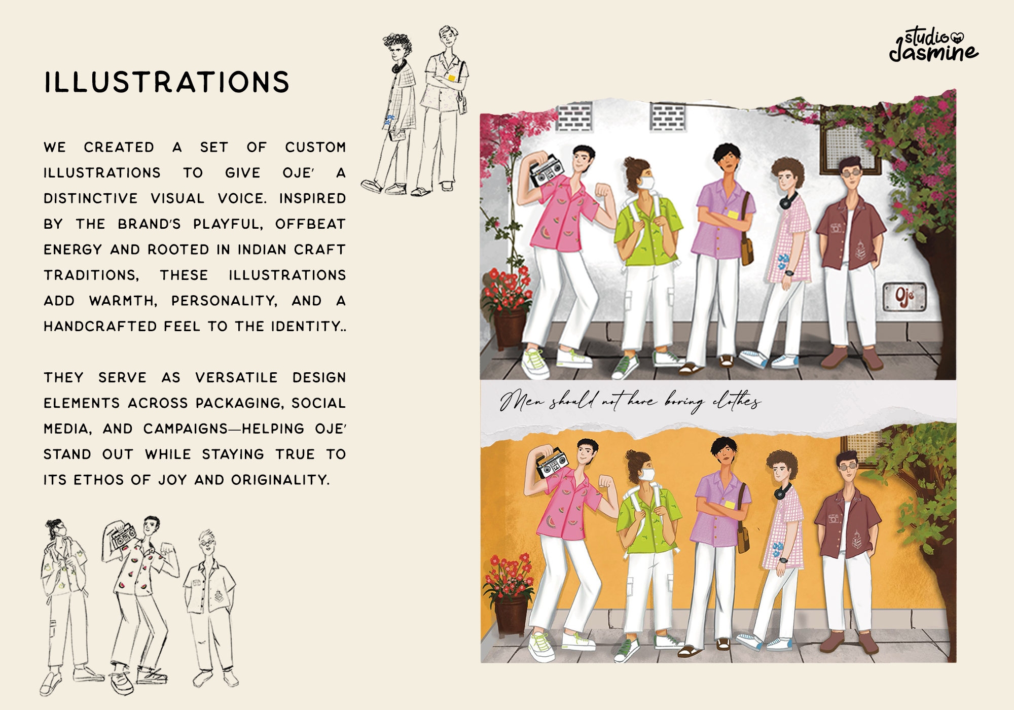
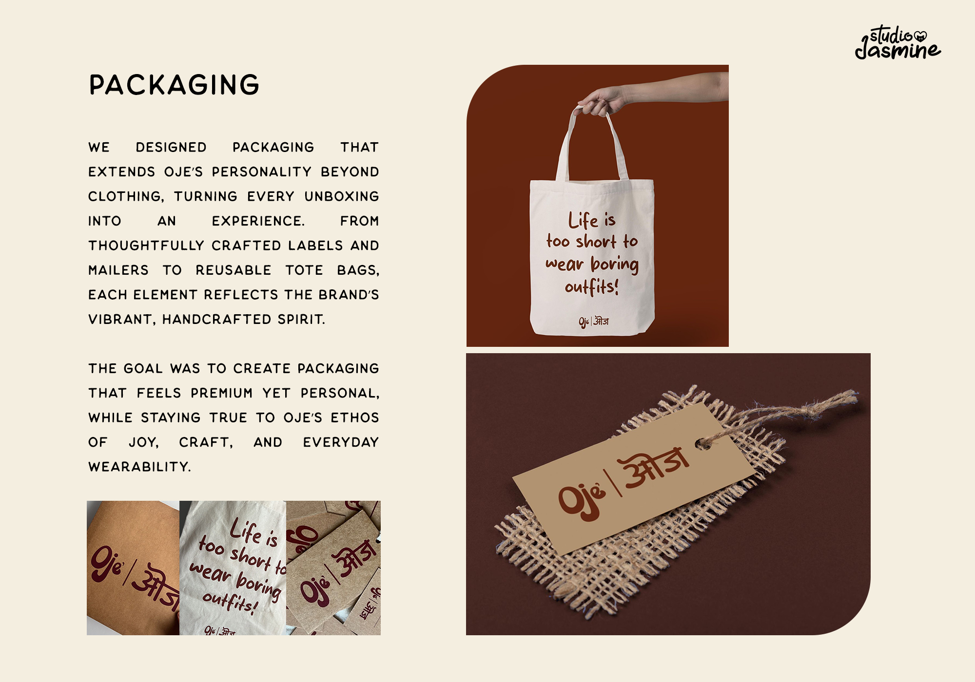
The visual language was designed to feel bold but unpretentious. The logo uses clean, confident typography with subtle quirks that give it an indie edge. A muted earthy palette grounds the brand, while secondary tones add depth and flexibility across applications. Typography choices balance minimalism with expression, pairing a modern sans serif with a raw, character-driven secondary typeface. Together, these elements formed a cohesive design system adaptable for packaging, digital platforms, and campaign visuals.

The final outcome was a brand identity that gives Oje a strong, independent voice in the menswear space.
Check out more about the brand here: https://www.ojeliving.com/
A creative partner helping you launch, evolve, and own your digital identity, with clarity and purpose.